Contrast diagram Eclipse/pyDev under TextMate
Problem:
when you start Eclipse on the screen with high resolution — can not see anything, and the attention is diverted into strange elements of the interface.
Colors to develop under Python seems uninformative.
Especially important for people with low vision, working without glasses on monitors with a resolution of 1680x1050 and above.
Objective:
1) find a skin which would be visually increased significant part of the interface (names of tabs, list items)
2) as well as visually reduced thingies, not bearing semantic load
3) choose a catchy and clear colors and fonts editor
4) it is desirable that all together it looked like (at least vaguely) editor textmate
The decision had been spent a couple hours trying different options at random.
Description helps you to save these few hours :)
All files are attached in the order in which I found them on the Internet.
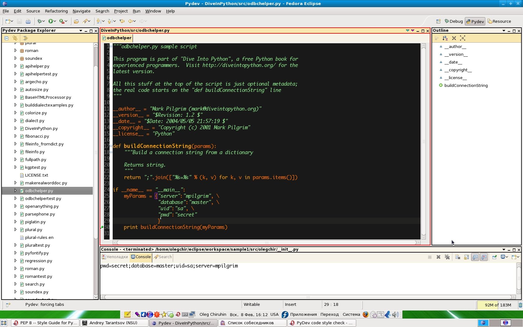
The result should look something like:
Method of obtaining is very simple.
It assumes that PyDev is already installed and Eclipse is running in English.
Process descriptions PyDev will not describe, and to run Eclipse in English, you need to launch it with parameter -nl: "eclipse -nl en_EN".
1. Panels
First you need to download the plugin "Extended VS Presentation", after installation the sidebar and the tabs will start to look like the screenshot.
Briefly, the installation process is
1) adding in the Help>Software Updates->Software is Avialable the new record "http://andrei.gmxhome.de/eclipse/"
2), and from this source the plugin Eclipse 3.4 plugins -> Extended VS Presentation (instead of 3.4 to substitute the current version Eclipse)
3) in menu "Window - > Preferences - > Appearance" to set Current Presentation at "Extended VS Presentation"
4) in the same menu option to set Current Theme to "High Contrast"
5) application settings require a restart Eclipse
2. Color
After selecting this item will change the color layout of the base template, but not for betonnogo code.
1) Then you must save the settings Eclipse. To do this, select in the main menu "File -> Export -> General -> Preferences" and stored where convenient.
2) Downloaded from the Internet file: (http://blog.codefront.net/wp-content/uploads/2006/09/Eclipse%20preferences.epf)
3) Apply the settings with the command "File -> Import -> General -> Preferences" with the path to the downloaded file.
3. Color PyDev
Selected color is purely subjective, and on any theory not based :)
I have not found how the easy way using the interface Eclipse export settings for PyDev, and in the configuration files to dig just laziness.
Maybe if someone from chitatelei knows what exactly need to do to export these settings automatically — I'll add to the description.
Manually color change "Window - > Preferences". In the list of topics you need to choose PyDev. That is the root element.
Color codes indicate the RGB in decimal.
Code: 255/113/0
Decorators: 0/255/0
Numbers: 229/229/229
Matching brackets: 160/32/240
Keywords: 255/163/0
Self: 255/93/0
Strings: 144/238/144
Comments: 192/192/192
Blockquotes: 255/255/0 (???)
Classname: 0/255/0
Function name: 155/165/0
4. Font
In principle, Monospace looks quite decent. But I would like to have a more pleasant (and some who and familiar) font is Monaco.
For Mac users this is not a problem because it is standard, and it is simple enough to put in the menu "Window -> Preferences -> General -> Appearance -> Colors and Fonts - > Basic - > Text Font"
For users of Windows and Linux — problem. Two parts: format and legality.
Second problem: I don't know how legal the operation of transferring a font from Mac to Windows/Linux.
Further should only be done in the full confidence that no problems with the license (or you these problems don't care).
The Internet is a big part of the Monaco files in format ttf doesn't contain Cyrillic. Or contains, but it looks horrible.
So here's a link to the Ukrainian file sharing, where is the normal version of Monaco: upload.com.ua/get/899991523
Font install according to your OS. For example, in Linux you can run the program kfontview, open the font and click button install.
Then go to the main menu Eclipse ("Window -> Preferences -> General -> Appearance -> Colors and Fonts - > Basic - > Text Font") and choose the font Monaco.
5. The size of the font.
Recently, I deeply wonder why the text on the screen look much more readable than it is now. Really I have so bad eyesight?
Then came to the conclusion that it's all in the screen resolution. The idea is if you increase the resolution to increase the quality, but actually decreases the size of the GUI elements. I assume that this is the legacy of the era of four-kilobyte machines... (somebody from habroloma knows precisely why this was done?).
In General, I opened the adjacent monitor in a resolution of 800x600 and looked at how labels look on it. Indeed, much more readable!
The second experiment was: what should be the font size to column width set text with accuracy, coincided with the 79 characters that are based on the guideline of Python?
Based on this experience I propose to establish the font size to 12 pixels.
This font helps to write the text according to the guidelines and to move away from the monitor at a comfortable distance.
UPD: (out of reviews)
6. Black background sockets in Linux from nuit
Taken from /usr/share/themes/Clearlooks/gtk-2.0/gtkrc (for the Clearlooks theme) and copy somewhere(I have it in the directory eclipsa)...
open the file, model fg_color/bg_color, etc. (basically, it is sufficient to correct only the top) to a dark color...
and run :)
GTK2_RC_FILES="/home/night/Desktop/eclipse/clearlooksrc" ./eclipse

7. Font size from iZENfire
Put in the settings of the graphics/fonts native resolution of the monitor is a "standard" 96dpi.
I have a 19"monitor at 1680x1050 106dpi font size 9P in Eclipse is normally displayed.
6. Font Consolas from pepelsbey
Try the Consolas font from Vist's. IMHO — the real killer is all monospaced fonts. Though, because he has drawn a true italic.
View screenshot this comment
Article based on information from habrahabr.ru
when you start Eclipse on the screen with high resolution — can not see anything, and the attention is diverted into strange elements of the interface.
Colors to develop under Python seems uninformative.
Especially important for people with low vision, working without glasses on monitors with a resolution of 1680x1050 and above.
Objective:
1) find a skin which would be visually increased significant part of the interface (names of tabs, list items)
2) as well as visually reduced thingies, not bearing semantic load
3) choose a catchy and clear colors and fonts editor
4) it is desirable that all together it looked like (at least vaguely) editor textmate
The decision had been spent a couple hours trying different options at random.
Description helps you to save these few hours :)
All files are attached in the order in which I found them on the Internet.
The result should look something like:
Method of obtaining is very simple.
It assumes that PyDev is already installed and Eclipse is running in English.
Process descriptions PyDev will not describe, and to run Eclipse in English, you need to launch it with parameter -nl: "eclipse -nl en_EN".
1. Panels
First you need to download the plugin "Extended VS Presentation", after installation the sidebar and the tabs will start to look like the screenshot.
Read about it on the page of the author (http://andrei.gmxhome.de/skins/index.html).
Briefly, the installation process is
1) adding in the Help>Software Updates->Software is Avialable the new record "http://andrei.gmxhome.de/eclipse/"
2), and from this source the plugin Eclipse 3.4 plugins -> Extended VS Presentation (instead of 3.4 to substitute the current version Eclipse)
3) in menu "Window - > Preferences - > Appearance" to set Current Presentation at "Extended VS Presentation"
4) in the same menu option to set Current Theme to "High Contrast"
5) application settings require a restart Eclipse
2. Color
After selecting this item will change the color layout of the base template, but not for betonnogo code.
1) Then you must save the settings Eclipse. To do this, select in the main menu "File -> Export -> General -> Preferences" and stored where convenient.
2) Downloaded from the Internet file: (http://blog.codefront.net/wp-content/uploads/2006/09/Eclipse%20preferences.epf)
This file was created in the distant 2006, and learn more about it is written here: (http://blog.codefront.net/2006/09/28/vibrant-ink-textmate-theme-for-eclipse/)
3) Apply the settings with the command "File -> Import -> General -> Preferences" with the path to the downloaded file.
3. Color PyDev
Selected color is purely subjective, and on any theory not based :)
I have not found how the easy way using the interface Eclipse export settings for PyDev, and in the configuration files to dig just laziness.
Maybe if someone from chitatelei knows what exactly need to do to export these settings automatically — I'll add to the description.
Manually color change "Window - > Preferences". In the list of topics you need to choose PyDev. That is the root element.
Color codes indicate the RGB in decimal.
Code: 255/113/0
Decorators: 0/255/0
Numbers: 229/229/229
Matching brackets: 160/32/240
Keywords: 255/163/0
Self: 255/93/0
Strings: 144/238/144
Comments: 192/192/192
Blockquotes: 255/255/0 (???)
Classname: 0/255/0
Function name: 155/165/0
4. Font
In principle, Monospace looks quite decent. But I would like to have a more pleasant (and some who and familiar) font is Monaco.
For Mac users this is not a problem because it is standard, and it is simple enough to put in the menu "Window -> Preferences -> General -> Appearance -> Colors and Fonts - > Basic - > Text Font"
For users of Windows and Linux — problem. Two parts: format and legality.
Second problem: I don't know how legal the operation of transferring a font from Mac to Windows/Linux.
Further should only be done in the full confidence that no problems with the license (or you these problems don't care).
The Internet is a big part of the Monaco files in format ttf doesn't contain Cyrillic. Or contains, but it looks horrible.
So here's a link to the Ukrainian file sharing, where is the normal version of Monaco: upload.com.ua/get/899991523
put a file there not I, but the comrades here on this Board: forum.0day.kiev.ua/index.php?showtopic=46936
Font install according to your OS. For example, in Linux you can run the program kfontview, open the font and click button install.
Then go to the main menu Eclipse ("Window -> Preferences -> General -> Appearance -> Colors and Fonts - > Basic - > Text Font") and choose the font Monaco.
5. The size of the font.
Recently, I deeply wonder why the text on the screen look much more readable than it is now. Really I have so bad eyesight?
Then came to the conclusion that it's all in the screen resolution. The idea is if you increase the resolution to increase the quality, but actually decreases the size of the GUI elements. I assume that this is the legacy of the era of four-kilobyte machines... (somebody from habroloma knows precisely why this was done?).
In General, I opened the adjacent monitor in a resolution of 800x600 and looked at how labels look on it. Indeed, much more readable!
The second experiment was: what should be the font size to column width set text with accuracy, coincided with the 79 characters that are based on the guideline of Python?
Based on this experience I propose to establish the font size to 12 pixels.
This font helps to write the text according to the guidelines and to move away from the monitor at a comfortable distance.
UPD: (out of reviews)
6. Black background sockets in Linux from nuit
Taken from /usr/share/themes/Clearlooks/gtk-2.0/gtkrc (for the Clearlooks theme) and copy somewhere(I have it in the directory eclipsa)...
open the file, model fg_color/bg_color, etc. (basically, it is sufficient to correct only the top) to a dark color...
and run :)
GTK2_RC_FILES="/home/night/Desktop/eclipse/clearlooksrc" ./eclipse
7. Font size from iZENfire
Put in the settings of the graphics/fonts native resolution of the monitor is a "standard" 96dpi.
I have a 19"monitor at 1680x1050 106dpi font size 9P in Eclipse is normally displayed.
6. Font Consolas from pepelsbey
Try the Consolas font from Vist's. IMHO — the real killer is all monospaced fonts. Though, because he has drawn a true italic.
View screenshot this comment

