Impersonal results pages of search engine giants
Search engines although not many, but they are, and they compete for audience. Not so long ago, Yandex has offered an updated page from the search results, where the search query string from sticking when you scroll to the top of the browser window. I was puzzled by the updated interface is the lack of individuality of search engines. When the user starts to scroll the page, losing the information about where the user is, there is no logos, no corporate colours. I propose to compare the usability of the pages with the search results of various search engines, which of the search engines cares about its users and values the corporate style.
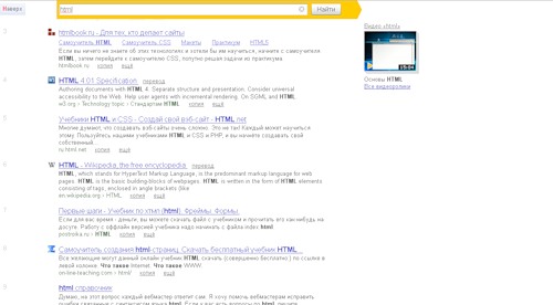
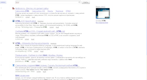
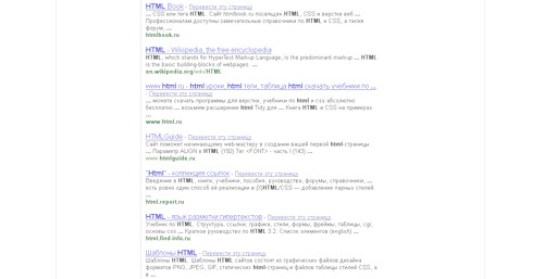
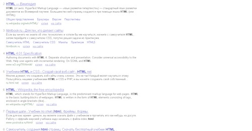
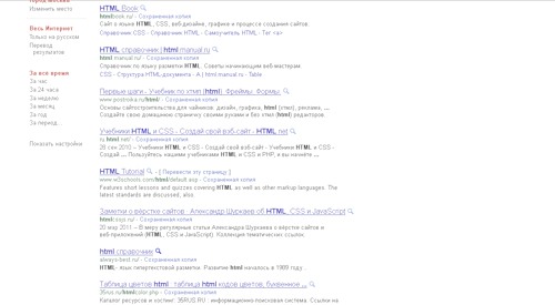
For clarity, the screenshots of the results pages of search queries, where should guess which search engine )
Tip for screenshots:
1. Yandex.
2. Yahoo
3. Rambler
4. Bing
5. Google
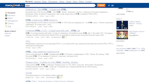
6. Mail
Obviously, what is common is the choice of colors fonts, blue link, black main text of the description page, and green additional information in the form of links to the page.
Exactly do you determine which search engine provided the answer to your question, will, perhaps, only an experienced user of search engines.
Suppose that such a choice of basic colors is dictated by extensive experience in building interfaces, and research in the field of attracting attention, but also the individuality of every search engine?
In my humble opinion it is quite obvious that from the results pages to find the most successful is the portal page Mail.ru
• on the page visible to the search query string
• on the page to see links to help clarify the user's request.
• on the page to see additional search results (images...)
• visit you can see links to additional portal services
• And what is especially important the user understands what search engine he asked the query.
Which search engines encourage web masters to create unique contetn and services, must lead by example. The similarity of 80% does not improve the perception of pages of search results, is not conducive to remembering the search engines, does not affect the liking of users.
Assessments that deserve the current search results page:
1. Yandex — 3
2. Yahoo — 2
3. Rambler — 2
4. Bing — 2
5. Google — 3
6. Mail – 5
Improve page search results in some cases can be very simple:
My version of the updated pages for Yandex, implemented minimal changes to the CSS, not any special graphical modifications page is not required.
Offer to help the search engines to make a really comfortable search interfaces for us.
Article based on information from habrahabr.ru
For clarity, the screenshots of the results pages of search queries, where should guess which search engine )

Tip for screenshots:
1. Yandex.
2. Yahoo
3. Rambler
4. Bing
5. Google
6. Mail
Obviously, what is common is the choice of colors fonts, blue link, black main text of the description page, and green additional information in the form of links to the page.
Exactly do you determine which search engine provided the answer to your question, will, perhaps, only an experienced user of search engines.
Suppose that such a choice of basic colors is dictated by extensive experience in building interfaces, and research in the field of attracting attention, but also the individuality of every search engine?
In my humble opinion it is quite obvious that from the results pages to find the most successful is the portal page Mail.ru
• on the page visible to the search query string
• on the page to see links to help clarify the user's request.
• on the page to see additional search results (images...)
• visit you can see links to additional portal services
• And what is especially important the user understands what search engine he asked the query.
Which search engines encourage web masters to create unique contetn and services, must lead by example. The similarity of 80% does not improve the perception of pages of search results, is not conducive to remembering the search engines, does not affect the liking of users.
Assessments that deserve the current search results page:
1. Yandex — 3
2. Yahoo — 2
3. Rambler — 2
4. Bing — 2
5. Google — 3
6. Mail – 5
Improve page search results in some cases can be very simple:
My version of the updated pages for Yandex, implemented minimal changes to the CSS, not any special graphical modifications page is not required.
Offer to help the search engines to make a really comfortable search interfaces for us.

